Styling
Usage of Element Design by Bayer
In HortiView, we use Bayer's element library as a foundational component and styling library.
The element library provides a set of components and styles that are used across the platform. When developing a module, you should use the element library to ensure a consistent look and feel across the platform.
To configure the usage of the element library, you can follow the instructions in the Element Design Guide.
Shared Components
We also provide so-called "Shared Components," which are frontend React components used within HortiView and Bayer modules.
This library is publicly available and can be utilized for your module as well: @hortiview/shared-components
Avoiding global styles
Due to module federation, you need to ensure that you do not alter any global styles of the element library, as this would affect the general styling of the element design system, which HortiView requires.
To avoid this, you could try using CSS Modules or similar approaches that encapsulate styles within your module only.
If you're unsure how to use CSS Modules, you can consult the documentation for Next.js1 or create-react-app2.
Avoid global styles
With module federation, your solution is dynamically loaded and embedded into HortiView at runtime. Using any global code, such as global styles or overwriting global style variables from frameworks like Element, may break the main application.
If such issues are detected during the review process, your module will be rejected. We strongly encourage you to use local styles for your solution/components.
Instead, use scoped styles, CSS Modules, or CSS-in-JS solutions to contain styles within the relevant components.
Host layering and z-index variables
The HortiView host application defines a global z-index scale on body in its global.css. Module developers should treat these values as the shared layering contract between host UI and embedded modules.
body {
    --z-index-zero: 0;
    --z-index-base: 1;

    --z-index-sticky-elements: 3;
    --z-index-map-header: 4;
    --z-index-map-controls: 5;
    --z-index-selects: 6;
    --z-index-drawer: 7;
    --z-index-mobile-menu: 98;
    --z-index-modal: 99;

    --z-index-above-all: 1000;
}
How to use these z-index variables
- Always reference the host z-index variables via
var(--z-index-...)instead of hard-coded numeric values. - Pick the lowest layer that solves the problem to avoid accidental overlap with platform UI.
- If your component must appear above a host layer, define a local module z-index variable derived from an existing host z-index variable.
Layer intent (recommended)
| Z-index variable | Intended usage |
|---|---|
--z-index-zero | Background elements and non-interactive decoration |
--z-index-base | Default content layer |
--z-index-sticky-elements | Sticky rows/headers inside module content |
--z-index-map-header | Map header overlays |
--z-index-map-controls | Map controls (zoom, filters, etc.) |
--z-index-selects | Select/dropdown surfaces |
--z-index-drawer | Side drawers and slide-in panels |
--z-index-mobile-menu | Mobile navigation menu |
--z-index-modal | Modal dialogs and dialog backdrops |
--z-index-above-all | Emergency/fallback layer only (use very sparingly) |
Do not redefine host z-index variables
Do not override these global variables in your module styles.
Changing them can break layering behavior across the whole platform.
Example
In this example, the module uses host z-index variables for a sticky toolbar and a drawer. It also defines one local z-index variable that is intentionally above the drawer, while still being tied to the host scale.
/* module.css */
.moduleRoot {
    position: relative;
    z-index: var(--z-index-base);

    /* Local z-index variable: above drawer, below modal */
    --module-z-index-flyout: calc(var(--z-index-drawer) + 1);
}

.moduleToolbar {
    position: sticky;
    top: 0;
    z-index: var(--z-index-sticky-elements);
}

.moduleDrawer {
    position: fixed;
    inset: 0 0 0 auto;
    width: min(420px, 92vw);
    z-index: var(--z-index-drawer);
}

.moduleFlyout {
    position: absolute;
    z-index: var(--module-z-index-flyout);
}
This keeps module overlays predictable and compatible with host-level menus and modals.
Module padding
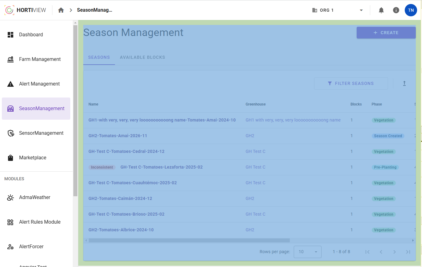
Our platform provides per default a padding of 0px on module pages to enable the possibility of developing fullscreen views.
Strong recommendation
If your module does not require any fullscreen features, we highly encourage you to add the following padding around your module content to ensure a consistent user experience within the rest of the platform:
- Desktop: 16px
- Mobile/Tablet: 8px
If you are a React developer, you can use the ModulePadding component from HortiView Shared Components to add the padding to your module. It will take care of setting the padding based on the viewport size.
The following screenshot shows the Season Management module with a desktop padding of 16px:
Health check screens
See the Health Check Screens guide for more information on how to style your module's health check screens.